
For SaaS, UI/UX design is everything. Even if your product is an app, the website is the first thing that prospective customers will see and it has to promise a great experience beforehand.
Nowadays web design is becoming more and more accessible. Landing pages can be made without any code and still look professional. Yet, not all the websites out there look great. To find out what works best, learn from the best SaaS websites.
Text

First of all, it has to be readable. It means a text that is big enough and contrasting to the background. Avoid wide text that has more than 10 words in one line. Bright photos with many elements are not the best background.
The hardest is to keep the text short. It is natural that we want to list endless awesome features of a product on the main page. Yet, we have to realize that very few people will be willing to read it all. Keep this text for those who pressed the button “Learn more” – and you’ll be sure your words reach the interested people and avoid those who skim fast.
Call-to-action

The “Learn more” button is one of the most popular calls-to-actions. The other options are “Find out”, “Shop now”, “Subscribe here”. Some SaaS would use more original CTAs like “We know you want it”,and it surely works for a certain segment of customers. However, you have to be careful with these. If your motivation is just to be “original”, check each CTA with the A/B test first.
Word “Free” works great as a trigger. See how Miro incorporated two CTAs on their page.
Call-to-action is a key element that impacts conversion rates. If you are not satisfied with the metrics of the website, one of the first things you should check is CTA.
Graphics

Good graphics is a good way to add a touch of style to your website. One of the best practices is to use the same UI elements as those used in your product. It creates a consistent visual image within the app, website, and other content. However, if the UI of your product is minimal and monochrome, it is totally fine to use bright colors on the landing page to draw attention.
If you’re looking for examples of great use of graphics in website design, see the products that work with visuals. Here is a landing page of Figma: a beautiful combination of signature UI elements, colors, and animation.
Pictures
It might be complicated to find the right picture when your product does not work with visuals and has no catchy images. Many SaaS would use generic pictures from photo stocks or generic illustrations from other stocks. It might not be the worst option, but also not the best one. Here are some of the ways to avoid those generic images.
- Screenshot. If you feel that the interface is not bright enough to catch attention on the landing page (which is totally fine for a SaaS product), try adding it on a nice mockup. Remember to pick the mockups with the latest models of devices.
- Real picture. It can be an editorial-style picture, a happy face of the users, or that photo stock-style picture that looks like a mockup yet being your own and unique. However, if the photo is just a background to the text, don’t overthink it.
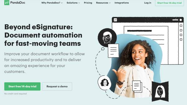
- Custom illustration. Basically, it is the same semi-abstract illustration but made specifically for your website. You can commission an artist or get an exclusive license. This way you ensure that no other product will have the same image as yours. Also, a good option is to combine photos with illustrations in one visual. Here is a great example by PandaDoc.
- Animation. Whenever you feel like the visuals don’t look catchy enough, try adding some motion. Animation makes magic in drawing the attention of the users. Even basic gif helps increase the time spent on the page, and if you manage to find a professional motion designer, your page performance metrics will level up instantly.
Videos
Statistics claim that 69% of people would rather watch a video than read a text when learning about a service. Good video is not easy to produce, but it can be extremely effective when you want to describe all the features of your product and there is no way you can fit it into one short paragraph.
However, don’t rely solely on video. Automatically played videos are considered bad manners. You need something else on the page that will engage the visitor enough to make them press the play button. And in any way, don’t forget about that 31%: maybe your customers are among them? Text and video work great together. Try writing your value proposition in one phrase and add a “how it works” video below.
Navigation
The menu is not the most catchy element of a page, but it defines how the customers interact with the website and, consequently, how high are the conversion rates. If we imagine the website as a house, navigation will be the foundation. While you want users to spend more time on your website, this is not the time they pass annoyed, trying to find the contact form or prices.
Typically, the websites would have a menu at the top and footer links. Some people would leave just one to get the most minimalist look possible, but it is better to keep both. Burger menu (three lines with drop-down menu) is a staple of mobile versions, but nowadays desktop pages also adopt this element.
Social proof
This element should not be overlooked. Yes, many reviews on the landing pages seem a bit fake, vague, and, surely, thoroughly curated. Yet this is an important part of a landing page.
How can you make these reviews look more credible? When you insert personal opinions of the users, make feedback not just praise: make sure that it highlights the features of the product that didn’t fit into the value proposition.
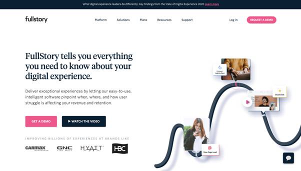
For a B2B SaaS, insert a picture, name, and title of users next to their feedback. Ask them to record a video. Add logos of the most acknowledged clients (the ones that consented to the usage of their logo, of course). When you have well-known clients, you can place their logos at the beginning of the page, as FullStory did.
Personal touch
In the crowded market of SaaS filled with smoothly designed websites, a touch of personality has a special value. Many companies adjust the tone of voice to make clients feel that there are real people behind the product.
What else can you do to enhance this effect? First of all, work on segmentation: it is hard to design a website with a personal touch when you don’t know well the person you want to appeal to. Second, let go of the strict official style in texts and visuals (think of modern business apps like Slack that are really fun to use). Last but not least, don’t forget about a picture of the team members: because there are real people behind every product.
Final thoughts
All websites consist of basic elements: text, pictures, graphics, videos, call-to-actions, menus, etc. In a great website, each element has its function and all of them are balanced.
If there is just one thing you will remember out of this article, let it be this: when in doubt, simplify.